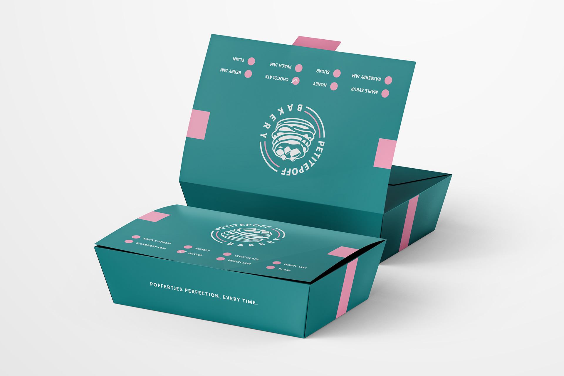
Small Dutch pancakes, in a teal box. Identity and packaging

PetitePoff Bakery

Client

PetitePoff Bakery

Industry

Bakery

Period

Services

Brand identity · Packaging

Context

PetitePoff Bakery makes poffertjes, the small, fluffy Dutch pancakes. We designed its brand identity and packaging.

The identity had to work above all on the objects in the shop: the box in the customer’s hand, the napkin, the apron behind the counter and the sign above the door.

What we built

The brand identity: the logo and a dot pattern taken from it, plus applications on the napkin, the apron and the shopfront sign.

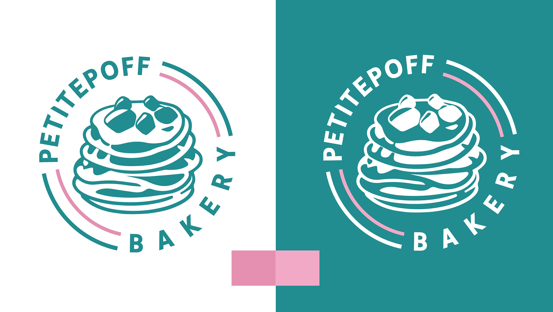
The PetitePoff Bakery logo (a stack of poffertjes inside a circle) in teal on white and white on teal, with the palette's pink accent
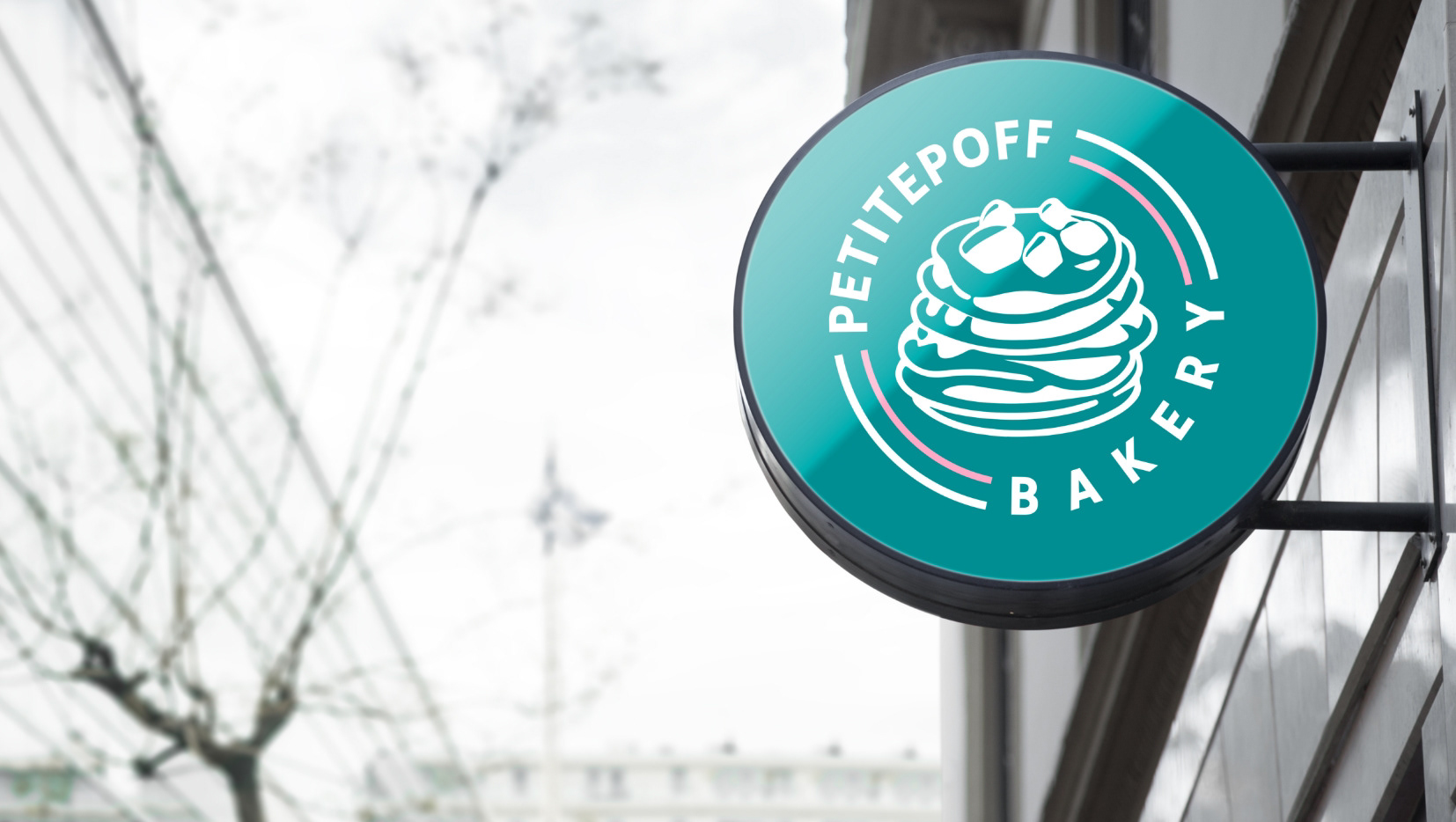
Round sign with the PetitePoff Bakery logo, bracket-mounted on the shopfront
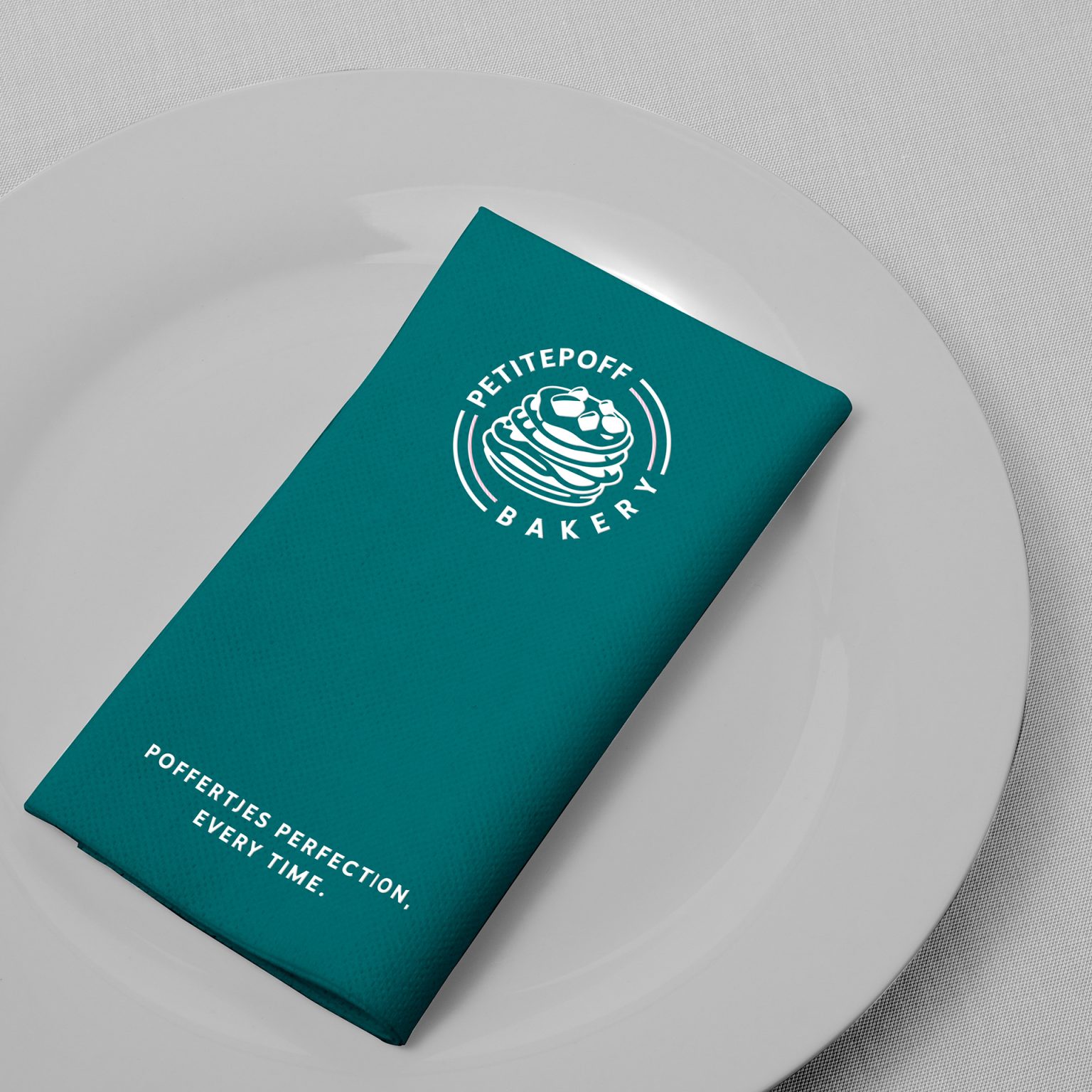
Folded teal napkin on a white plate, with the logo and the line “Poffertjes perfection, every time.”
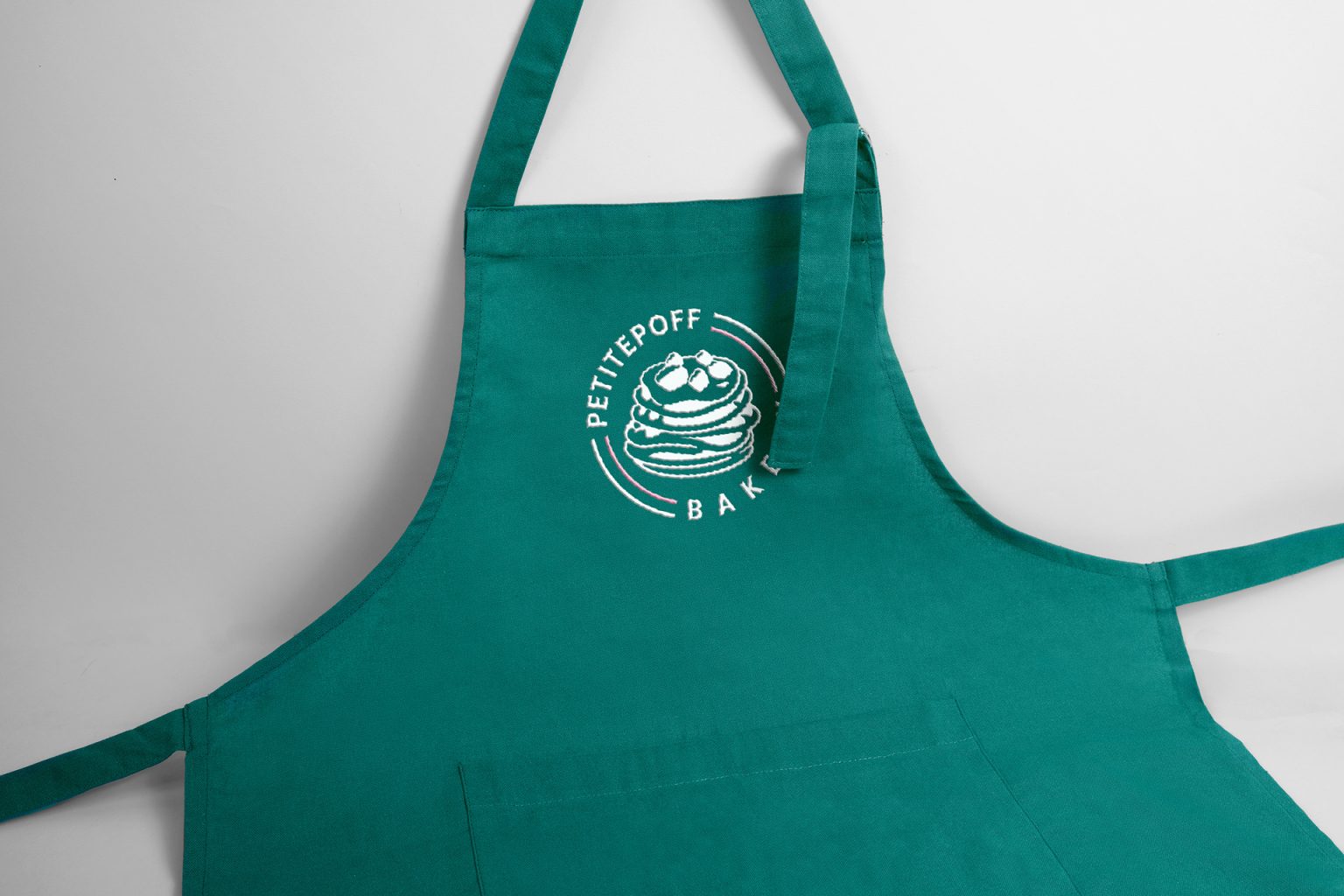
Teal apron with the white PetitePoff Bakery logo on the chest

The packaging, in the same identity: the Party Box with its handle, and the product boxes, with a list of toppings to tick on the lid.

Teal product box with a hinged lid, pink bands, the logo on the lid and a tick-list of toppings
The teal dot pattern, arranged in concentric circles, taken from the logo

The dot pattern, arranged in concentric circles, comes from the logo and is drawn in the palette’s teal.

The services behind this work

This work is an example of these services. If you need something similar, each service page says what it includes and how we work.

Keep going. From the same category

Tell us how it should work. We build the rest

we reply on the channel you wrote on