Context
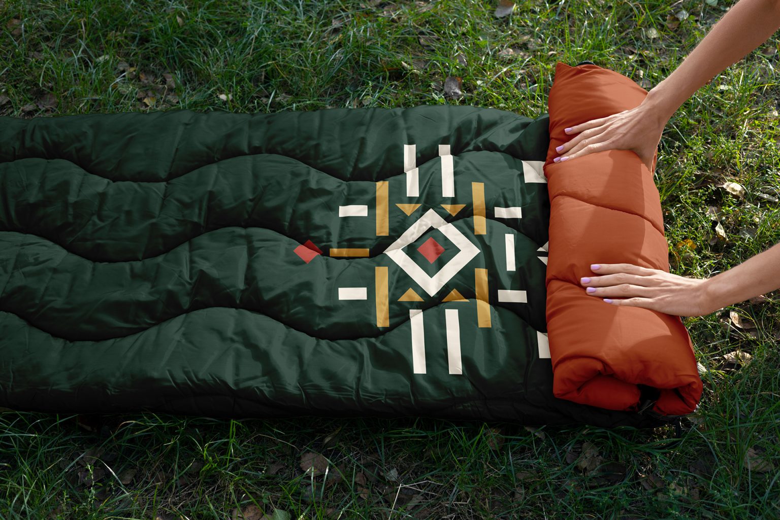
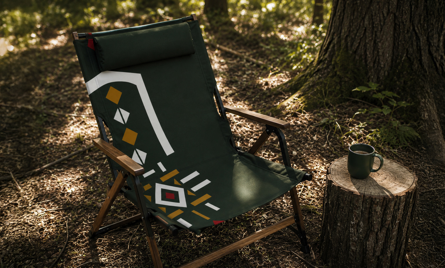
Legendele Gorjului is a cultural festival built on the traditions, history, people and legends of Gorj, in southern Romania. We designed its visual identity: an emblem that stays the same, a theme that changes from one edition to the next, and everything that carries them, from flags and signs to posters and merchandise.
The challenge
The festival starts from tradition, but the identity was not meant to copy folklore. We looked for a contemporary mark, simple and easy to remember, in which the folk motifs can be recognised without being reproduced literally.
Each edition also has its own theme. The identity had to take on a new one every time, without the emblem changing.
What we built
From symbols to emblem. The logo is built from six symbols, each with its own meaning: the axis, the gate, the traditional motif, the woven cloth, the angle and the rhombus. They come from Romanian embroidery and from the memory of the place. We pared them down to their essence and brought them together in a single mark.
The axis, the column, the infinite. The vertical axis suggests continuity, memory and the link between past and present.
The gate, the passage. The gate marks the way into a place of stories and the passage between generations. In the logo, its shape is the frame that holds everything together.
The traditional motif. It comes from traditional embroidery, where the rhombus, the dot and repetition set the rhythm. It ties the identity to the dress and the craft of Gorj.
Flax, weaving, cloth. The weave recalls white flax, hand-worked cloth and the way signs are passed on through stitching.
The angle, the direction. The angle suggests a road, a bearing and movement towards something better.
The rhombus, the land, memory. The rhombus is the sign of the place, of the land and of roots: memory that is kept and passed on.
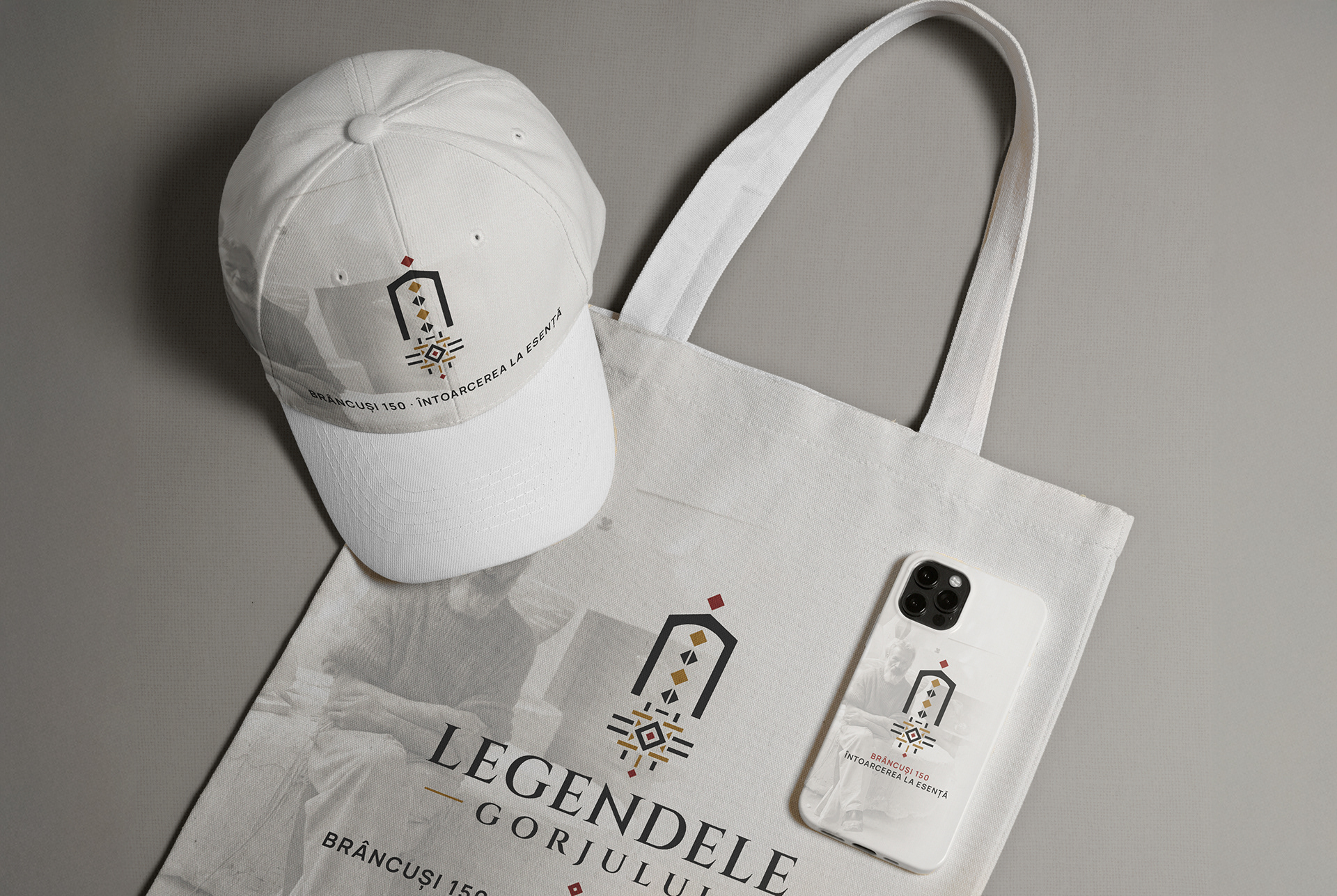
The emblem. The symbols come together in a simple mark in which you can make out a gate, an axis, a weave and, at the centre, a gathering place. The logo has three parts: the symbol, the festival’s name and, where needed, an extra line such as “Ediția I” (first edition). The symbol can also stand alone, wherever the festival is already known.
Lettering and colours. The name is set in letters of classical proportions, and everyday text in a plain, easy-to-read typeface. The colours come from the place: the warm black of the soil, an old gold, the red of the embroidery, the white of flax and the deep green of the forest. The background is a linen cloth, like the one the signs are stitched on.
The theme of the first edition, Brâncuși 150 · A Return to Essence, draws on Brâncuși’s workshop, on sculptural forms and on stone textures. It sits on top of the emblem, which stays unchanged.
The manual. The rules are gathered in a 28-page visual identity manual: logo, colours, lettering, textures, ornaments, voice and tone.

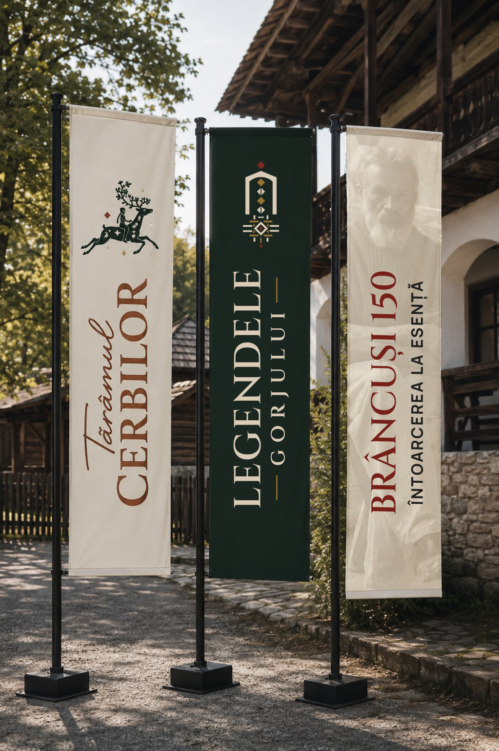
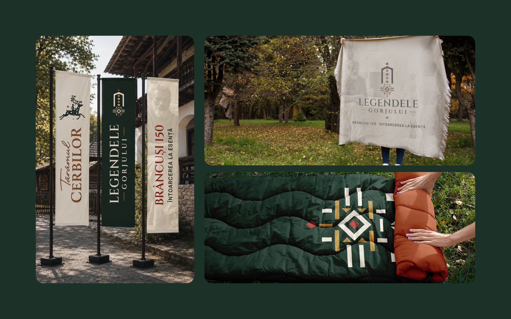
The edition flags
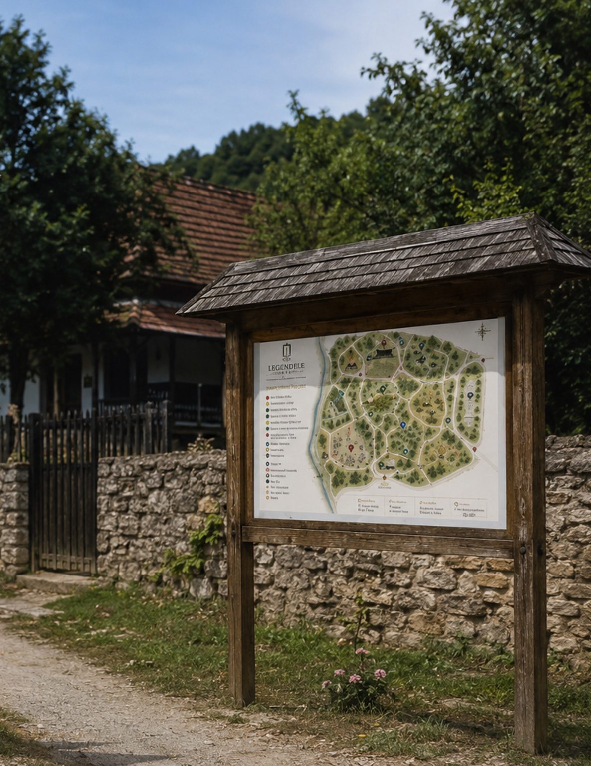
The festival map
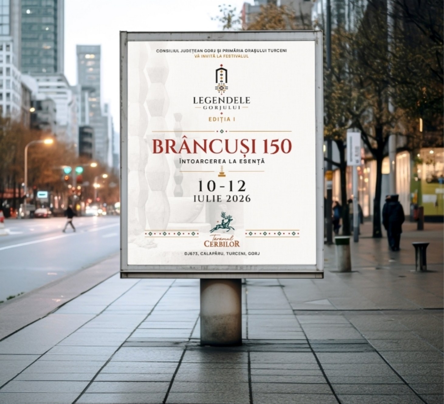
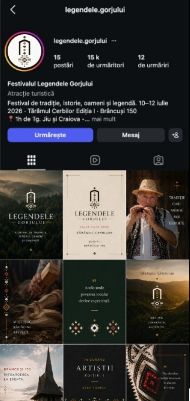
The poster and social media. The edition’s image on a street poster, and the festival’s Instagram profile, with the same colours and the same emblem.
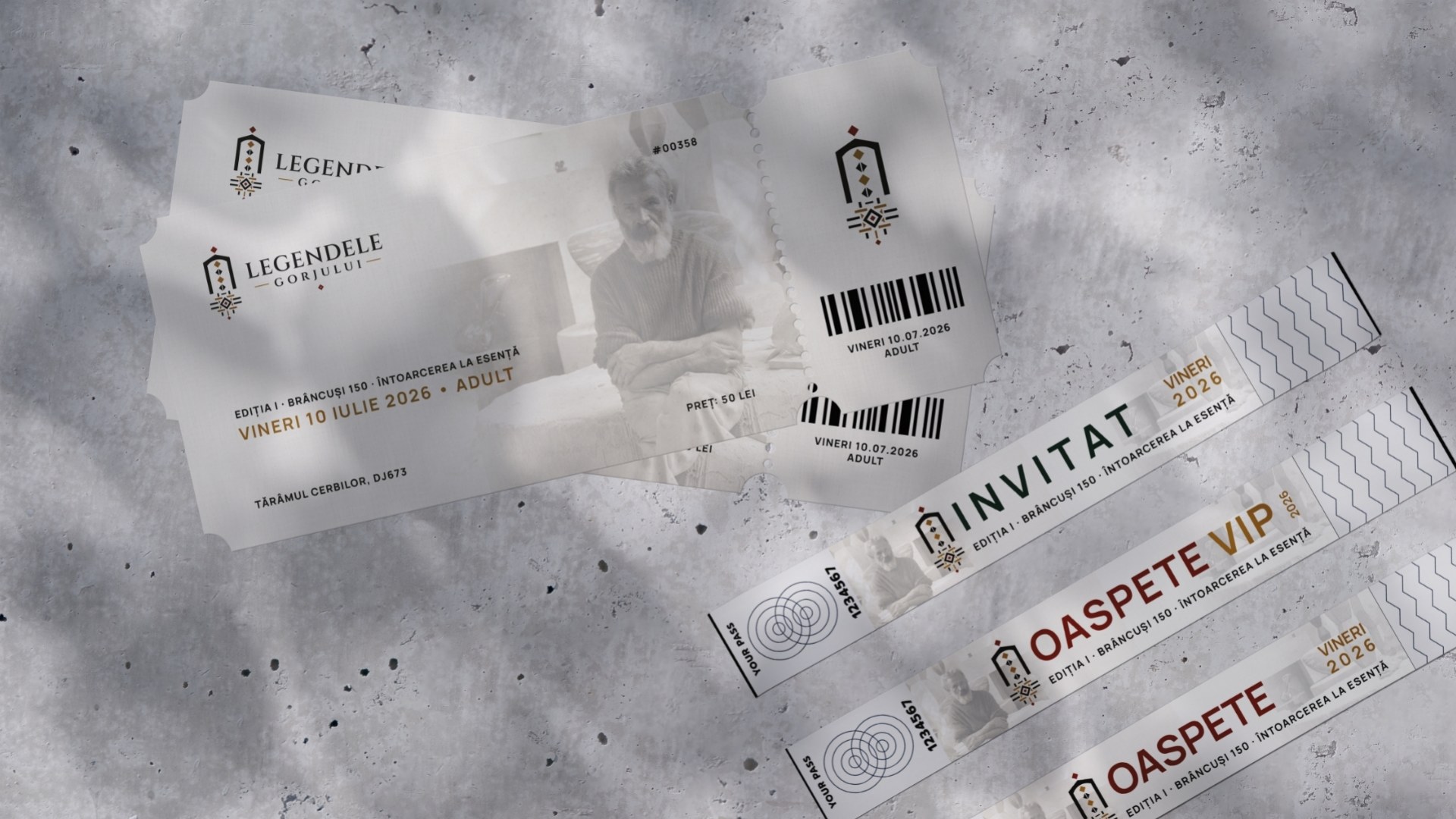
The tickets and access wristbands, for the public, guests and VIP guests, with the emblem and the edition’s theme.
Result
The festival has an identity designed for more than one edition. The first, “Brâncuși 150 · A Return to Essence”, was held on 10–12 July 2026, at Tărâmul Cerbilor. It was organised by Gorj County Council and Turceni Town Hall.