
Drinxlab is a premium cocktail service that presents its drinks as a blend of science and creativity. Hence the tagline: “the science of mixology”. We created its brand identity: the logo, the typography, the colours and the visual language.
The name points to a laboratory. The mark had to convey the same thing: precision and refinement. The brand also had to look the same everywhere, from an icon to event material.
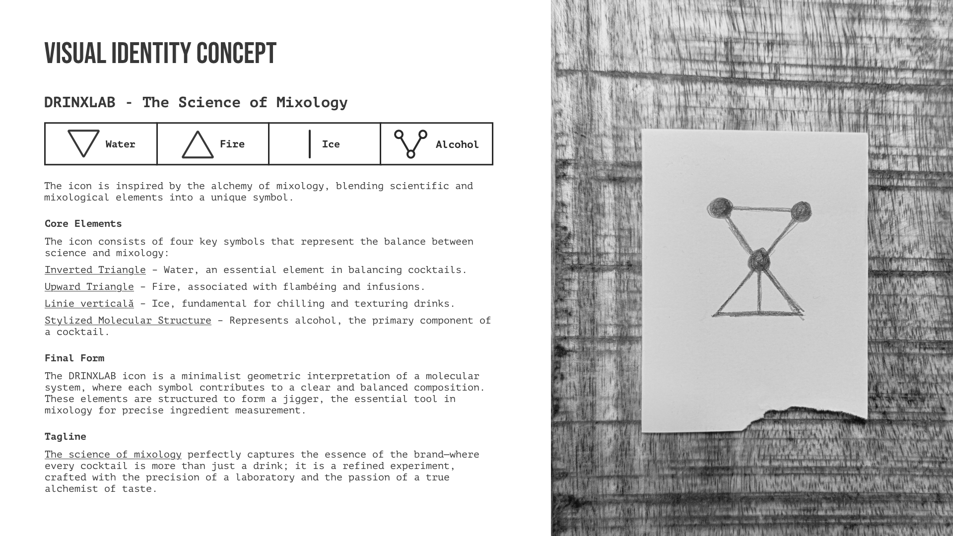
The mark. We started from four symbols: water, fire, ice and alcohol. We combined them into one geometric icon, first sketched in pencil.
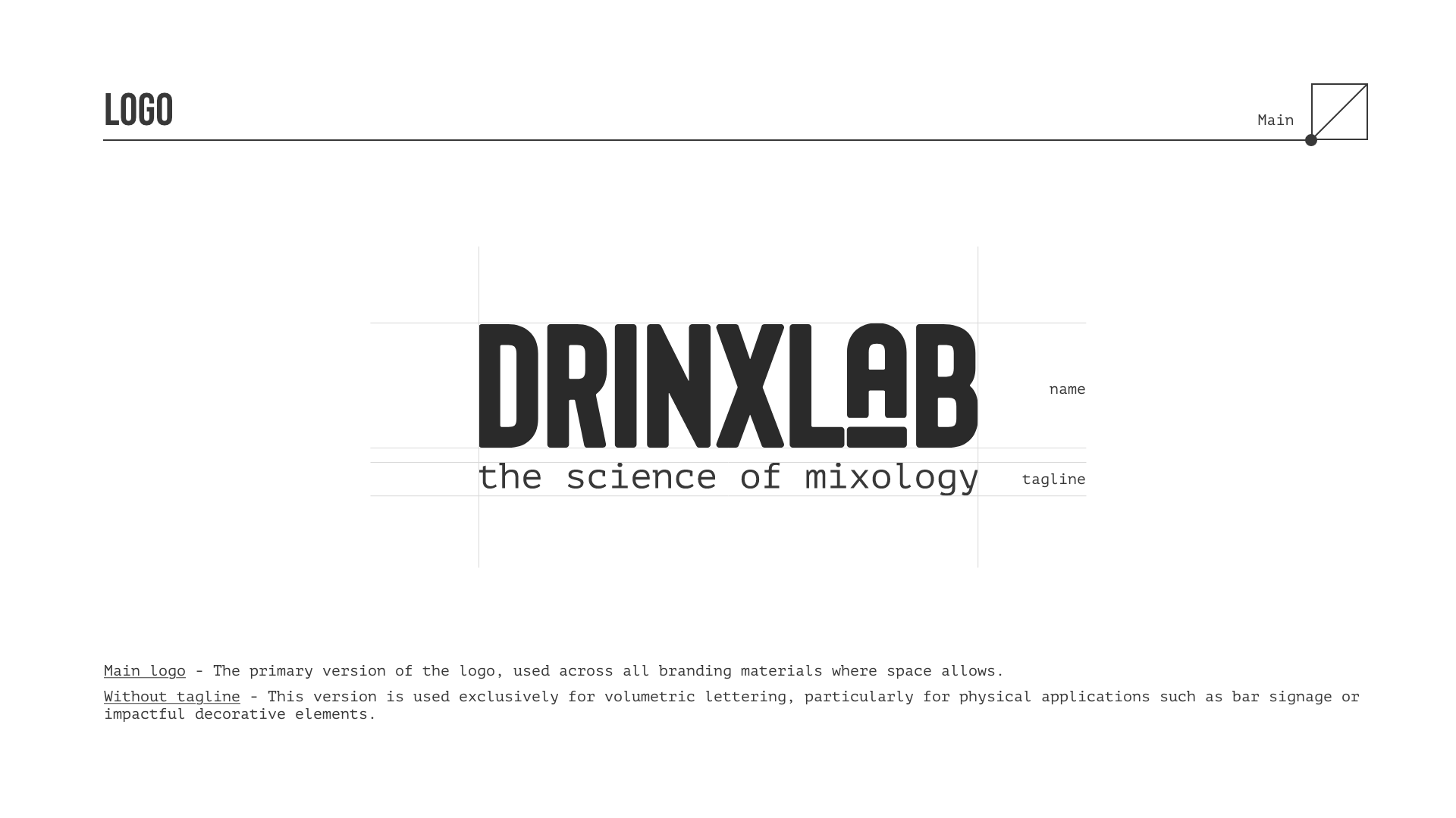
The main logo, with the tagline “the science of mixology”, drawn on a construction grid, and its variants for different formats, from an icon to a flyer.
In use: the black events flyer, with the logo in white.
This work is an example of these services. If you need something similar, each service page says what it includes and how we work.
we reply on the channel you wrote on