Context
Coquette Designs is a floral design atelier inspired by nature and by work done by hand. We refined its visual identity and gave it clear rules, so the brand looks consistent on packaging, stationery, textiles and print.
The brand already had an image its audience recognised. Its elements, however, were applied differently from one piece to the next, and over time the material became cluttered and its messages unclear. It no longer looked like the brand.
Before
What to keep and what to put in order
There was no need for a new brand. What the audience recognised and loved had to stay. The rules were missing: which element is used, where, at what size and with how much space around it. And the system had to work in print and on screen, including for material still to come.
What we built
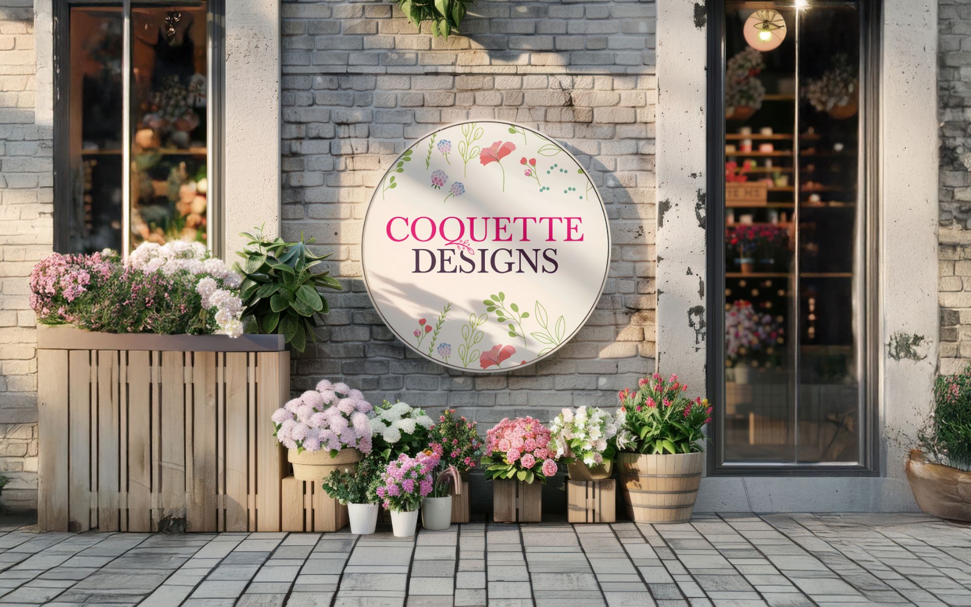
We kept the brand’s style and refined it: small visual adjustments, a clear structure and a few new elements. Together they became one system, with rules for its use, applied to packaging, business cards, textiles and bouquets.
The same system carries over to a magazine: the logo on the front cover, the QR code on the back. With the rules in place, any new piece is made in the same style as the rest.