A floral atelier in Sighișoara. Logo, typefaces and palette, refined

Brotherie

Client

Brotherie

Industry

Florist and events · Sighișoara

Period

Services

Identity refinement

Brotherie

Context

Brotherie is a floral atelier in Sighișoara: flower arrangements, gifts and decor for private and corporate events. We refined its visual identity: the logo, the typography and the colour palette.

The flower in the logo was distorted and unclear, the name was hard to read, and the colours did not sit well together.

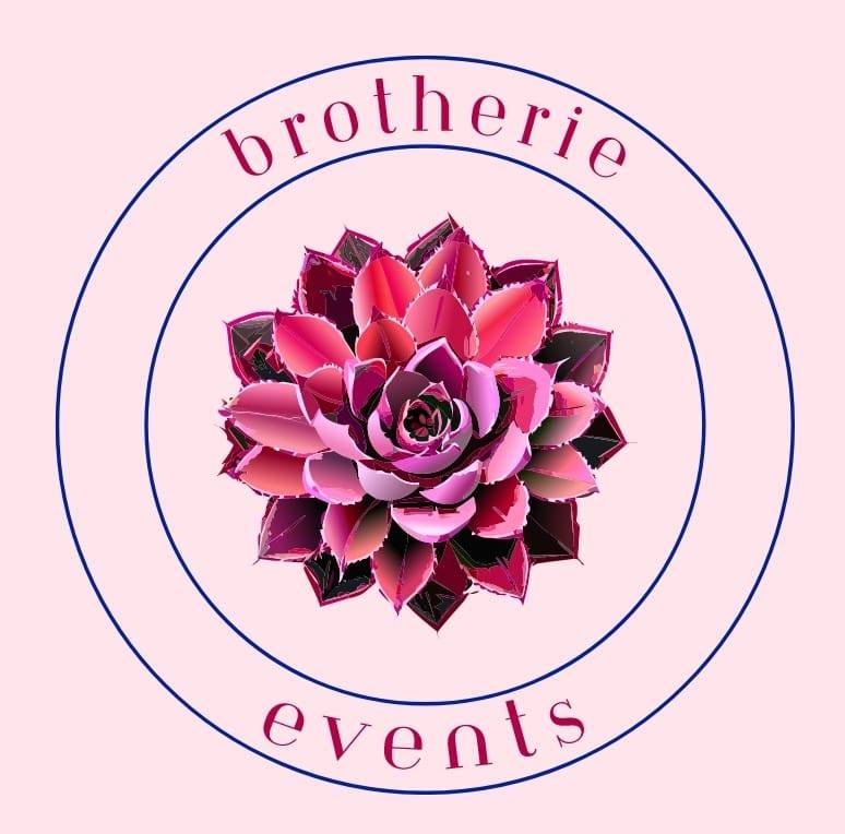
The Brotherie logo before the refinement: a pink succulent flower with ragged edges, between two circles, on a pink background

Before

The same logo, put right

Brotherie did not need a different logo. The flower had to stay the same, but drawn cleanly. The name had to be easy to read, and the colours had to sit well together, on screen and on paper.

What we built

We put three things right:

  • The logo: we corrected the distortions in the flower and cleaned up its outline. The flower itself stayed the same.
  • The typography: typefaces that complement each other, chosen so the name reads easily and looks current.
  • The palette: we rebalanced the colours into a palette of six, for screen and for print.
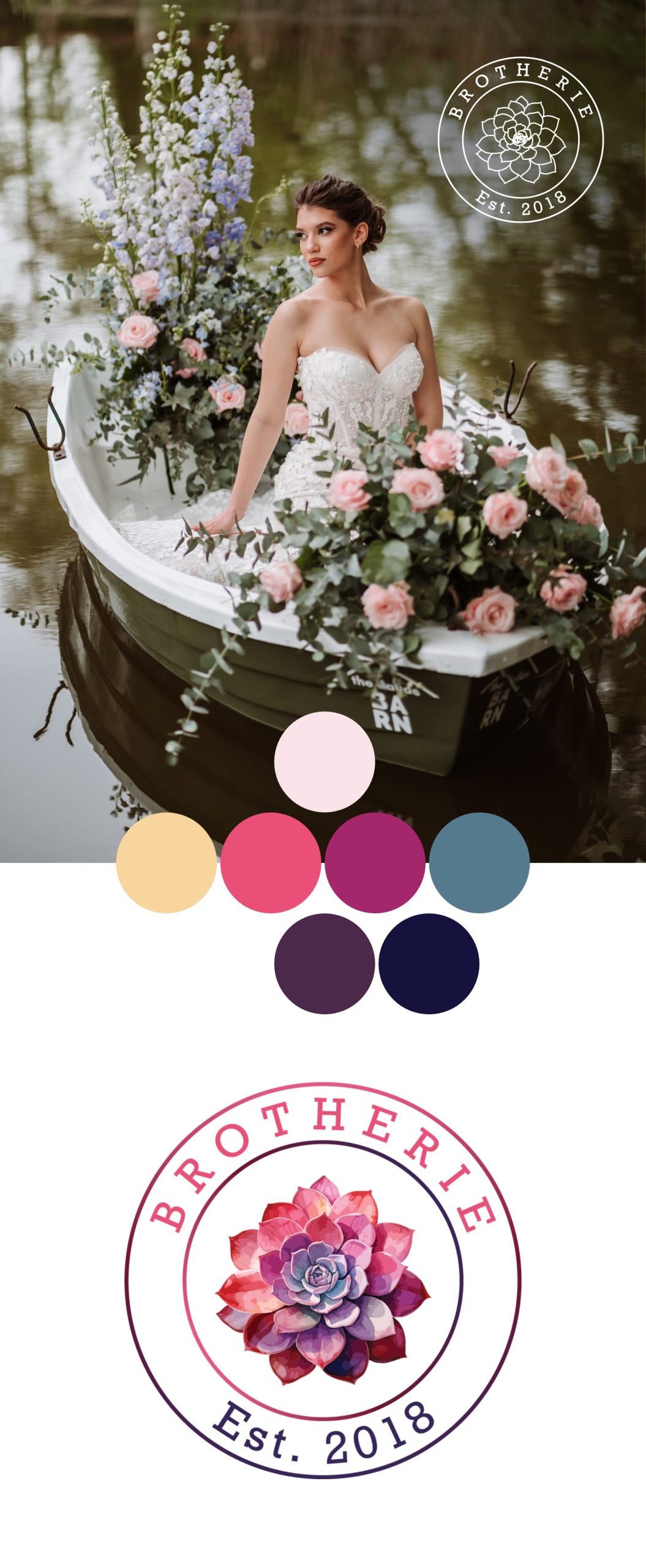
The refined Brotherie identity board: a bride in a boat full of flowers with the white logo in the corner, the six-colour palette in circles and the refined logo, with the succulent redrawn and “Est. 2018”

After

The services behind this work

This work is an example of these services. If you need something similar, each service page says what it includes and how we work.

Keep going. From the same category

Tell us how it should work. We build the rest

we reply on the channel you wrote on