We created Brite’s brand identity: the logo, with the tagline “Just Enough”, and the colour palette.
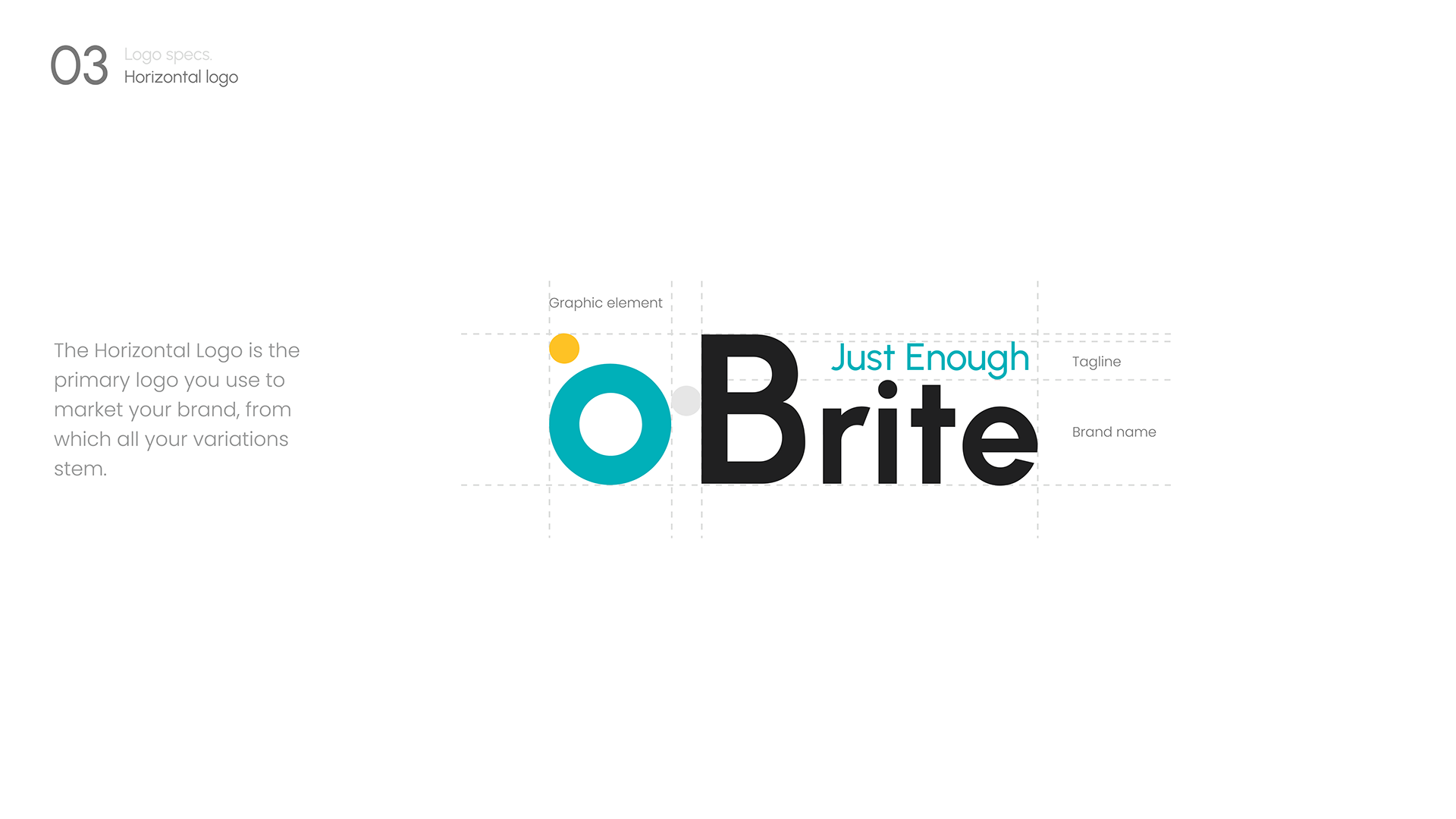
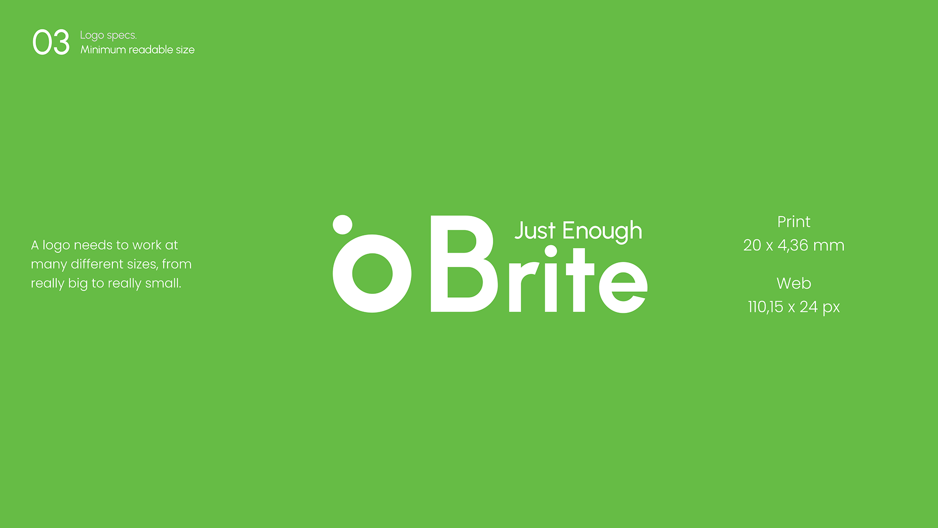
The logo has a main horizontal version, from which the others stem, and minimum sizes set for print and for the web.
The primary palette is turquoise, yellow and black, with codes for screen, print and Pantone. The secondary palette gives a colour pair to each of eight areas: accountancy, HR and recruiting, projects, meetings, healthcare, email, travel and surveys.
This work is an example of these services. If you need something similar, each service page says what it includes and how we work.
we reply on the channel you wrote on