
Client
Omega Medical
Industry
Medical · infrastructure for hospitals and clinics
Period
Services
Brand identity · Website
Omega Medical is a Bucharest company that designs and equips hospitals and clinics: operating theatres, intensive care, imaging and other departments. It handles the design, the implementation and the permits and approvals, as well as hospital IT.
We created its brand identity and its website.
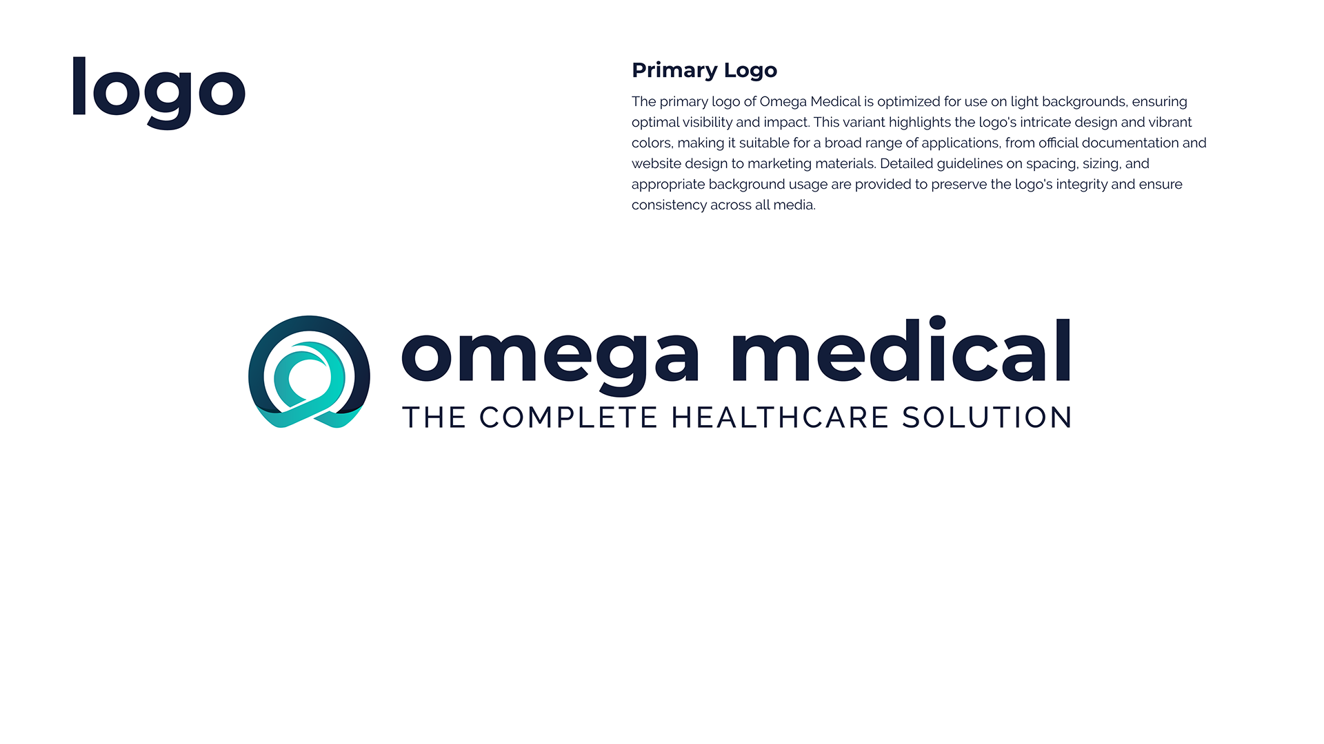
The brand identity: the logo, built on the omega symbol in turquoise and navy, and the visual identity manual. The manual shows the primary logo, for light backgrounds, and the rules for spacing, size and background.
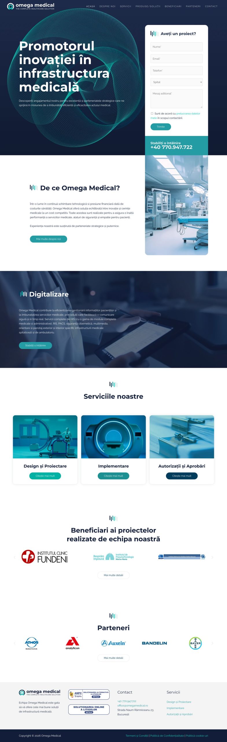
The website, omegamedical.ro, built on the same identity: the turquoise line illustration, the bars beside the headings and the brand colours. It has pages about the company, its services, products and solutions, beneficiaries and partners. The home page carries a “Do you have a project?” form, where visitors say whether they are writing on behalf of a hospital or a clinic.
WordPress, Elementor.
This work is an example of these services. If you need something similar, each service page says what it includes and how we work.
we reply on the channel you wrote on